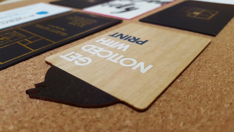
What happened last time you handed your business card to someone? Did they politely thank you and slip it into their pocket? If you think that is a successful card, you would be wrong. A successful card gets a very different response. After you hand it to someone they accept it, do a double-take, and are compelled to comment on it. You find yourself in a comfortable conversation about the card and building rapport. That is a successful business card.
The Role Of Business Cards
In the past, the role of the business card was to give contact details to a customer. But in today’s connected world, there are many better ways for customers to contact you. Email signatures, Google searches, Facebook profiles all readily provide contact information.
It makes business cards seem anachronistic. A quaint artifact from a past age. But let’s face it, if cards were going to disappear, they would have by now, and they haven’t. Despite all the modern conveniences, business cards are still an excellent way to give someone your details particularly in face-to-face situations.
But let’s face it, if business cards were going to disappear, they would have by now, and they haven’t.
Sometimes the first time you meet someone it can be a little awkward. What do you talk about with someone you don’t know. In a professional setting, a business card is an opportunity to dodge the obligatory ‘so what do you do?’, and overcome this first moment with a non-threatening topic of conversation. If you do it right, the card will spark a conversation, not about the design content of the card, but the physicality of it.
We all know that customers buy from people who they know, like and trust. Through chit chat about a business card, you build rapport, and through rapport, you build ‘know, like and trust’. The conversation will be about other things. When I started using timber cards, I found the initial conversations I was having at networking events were completely different, because they start from somewhere different, and went somewhere different.
Sounds great, so how do you make a remarkable business card?
It’s not hard, but there are two common mistakes people make.
Show With Your Business Cards
Business cards have become a race to the bottom to spend the least amount possible on production then try to stand out with the design. Marketers agonize over font selection, point size, and colour palettes. But here’s the thing.
No one cares.
No one cares if you did 12-point Garamond or 11-point Arial. The only person who will notice that you spent $300 buying a font, other than the designer who convinced you to do it, is the printer. And the printer will only notice because that same designer doesn’t know how to prepare files for print, so the font is glitching and dropping characters, or outputting as Times New Roman.
But people will notice the material your card is made of.
Remarkable cards aren’t made by graphic design. They are made through materials and the production processes used to make them and augmented by design.
400gsm double-sided matt cello business card is the most popular configuration, and it’s perfectly adequate. But is that who you are? Is that what your brand is? Adequate? Because adequate is what an adequate card will communicate regardless of what the graphic design says.
A business that provides high-quality service should provide high-quality everything. A Michelin star restaurant doesn’t serve its food on disposable plates. A limo driver wears a suit, not a polo shirt. Quality, or brand values, are communicated by what you do, not what you say. It is meaningless when your business card says “high-quality service” because talk is cheap and everyone says that. To meaningfully communicate a quality service value you must demonstrate it by using quality materials.
Don’t think that people won’t notice. We have been playing with paper since we were babies, and have been surrounded by it ever since. People know quality paper when they feel it.
Business cards have a tactile characteristic, unique to print in communication channels. People will touch it and engage with it through our largest sensory organ, our skin, and through the most sensory dense part of our body, our hands. Our hands have more sensory inputs than the entire torso, arms and head excluding the face. Hands are powerful meaning-making interfaces and people will hold your cards with them. They will know if the card is quality or not.
Show that you are a quality business, don’t tell.
Invest in your Business Cards
Sometimes business cards feel like a waste of money. From 20 odd years in the print industry, I can tell you that the number one reason people order business cards is not that they have been enthusiastically handing them out. It’s because some detail has changed. A new phone number, new staff member, new address and so on. Some minor yet critical detail needs to be updated. If you’ve ever done this, and I know you have, it just makes cards seem like a waste of time and money. After all, you didn’t even use the last lot of cards, now you’re forking out to get a new set to sit in your drawer and not use.
It is this thinking that leads people to tighten the purse strings when it is time to buy more cards, and it is a mistake.
Change your mindset from getting the minimum quantity to the lowest price. Instead, get the quantity you could use for the price it costs. Forget 250 cards at $0.30 each, and go for 50 cards @ $3.00 each. To create a rapport every time you hand over a card, you need to do something more than what everyone else is doing, and that is going to cost more than $0.30 per unit.
Is that a cost jump? Yes, but that is what a really good card costs. Most modern marketers have spent $3 or way more for a Google Ad click that they don’t even know wasn’t generated by a click farm bot, accidental click, or a malicious competitor. In that context surely spending $3 for a card that will be given to a real person generating a real conversation and real rapport shouldn’t be hard to justify.
Basic or adequate business cards ARE a waste of money. If you want good or remarkable cards, they will cost more. They will be an investment, not an expense.
New Business Cards
The best way to avoid these mistakes is simple. Spend less time and money on a graphic designer, and spend more per card.
Small quantities are available because remarkable cards are typically produced using processes that are less automated, and so well suited to runs as short as 50 cards.
Letterpress printing can use extremely thick paper stocks that are measured in micrometres rather than weight. It also allows for embellishments like embossing, foiling and painted edges.
Flatbed printing can print onto rigid substrates like acrylic, steel or wood. It’s not necessary, but materials like this have potential synergy with businesses that actually make use of them. A carpenter with a timber card, an engineer with a steel card.
Laser cutting machines are often paired with flatbed printing and so those exotic materials can be cut to almost any shape, and if you stay within the normal business card size, likely at little additional cost. Rather than printing a name, you could make the card a stencil, or cut it to the shape of your logo or mascot.
Digital offset printing has developed a technology called Scodix which makes spot gloss varnishes and metallic foil finishes available particularly with variable data. Double sized cards with a fold are easily accessible.
As weird and wonderful as you can go, it isn’t necessary. Simply taking your current business card design and putting it onto a high quality or exotic material will be enough to make it remarkable.
Bold Business Cards
Recently I worked on an architects business cards during a rebranding. He designs bespoke, high-end homes. He was making both mistakes. He was indecisive about the design, hunting around for fonts, agonizing over left justification or right. He was asking me about quantities, to get the fewest for his new team member, and what is the unit cost if we doubled the quantity.
While reviewing the graphic design yet again his business coach weighed in and said “the design doesn’t really communicate the high-quality brand that you are trying to create.” This was the first time I had heard the goal was to communicate quality, so I weighed in. I told the architect that if he wanted to communicate quality then he should stop playing with the design and change the materials. “As an architect, more than anyone you understand the difference that materials make. If a building included a front door hand-carved out of a beautiful piece of timber, it would still be an amazing door no matter what colour you decided to paint it. What makes the door amazing is the materials used, not the surface coating. Print is exactly the same, it doesn’t matter what ink you put on it, quality material will still be quality material, and it will communicate quality.”
It was like a switch was flicked, he transformed from vacillating to confident. He knew exactly what he wanted his card to be like. He went from 500 adequate cards to 100 cards on a super thick black 700gsm matt stock with gold foil on both sides, no ink. He had been playing with a list of services on the back of the card, trying to get the copy just so to communicate his brand values, but now, he swept all that away and replaced it with his logo icon and no words.
These cards were not cheap, there is no way he is going to stick them under windscreen wipers at the next home show. They are an asset that he uses strategically to help close important deals.
The end result was a striking, elegant and bold card that clearly communicated confidence and quality. These cards were not cheap, there is no way he is going to stick them under windscreen wipers at the next home show. They are an asset that he uses strategically to help close important deals. They give him confidence and pride in his collateral, which gives his customers confidence in him, and best of all they spark conversation which builds rapport.
Have Awesome Business Cards
Remarkable cards won’t languish in your drawer. They are an investment, you will want to show them off because they’re yours and they’re awesome and not like anyone else’s. If nothing else the damn things cost so much you better use them.
Remarkable cards won’t remain in your drawer. They are an investment, you will want to show them off because they’re yours and they’re awesome and not like anyone else’s.
Be bold with your cards, you want them to stand out, take advantage of all the materials and production methods that are available to make something remarkable. Don’t sweat the design, let the materials do the talking. Invest in them to create an asset that you will be proud to use and people will want to talk about.
You might also enjoy these print and advertising articles:
- How Printing Quality Can Affect Your Marketing Message: 5 Common Mistakes Businesses Make
- The State of Print Advertising in the Digital Age
- Is Traditional Marketing Dying?
- Prioritising Your Digital Signage to Get the Most Out of Your Business
- Why Your Business Should Invest in Digital Logo Design
Daniel Edwards
Latest posts by Daniel Edwards (see all)
- Why Most People Get Business Cards Wrong - October 10, 2021


