


Mobile optimisation is no longer a choice. Here’s how you can prepare your website for Google’s Mobile Mandate.
What Is Mobile First Indexing?
Mobile first indexing means that Google uses the mobile version of your website as the starting point for determining rankings.
Previously, a website’s desktop experience was considered the primary version of a website, and mobile was the alternate. Then Google allowed webmasters to opt in for their mobile site to be indexed too. And now, mobile first indexing is more important than ever as Google progressively rolls it out across all websites.
How to Know If You’re on the Mobile First Index?
The first, and easiest way to know if you’re on the mobile first index is to check for a message in Google Search Console (if you haven’t already got this set up, we would highly recommend it) with the subject “Mobile-first indexing enabled for …”. In Google Search Console you may also notice a significantly increased crawl rate from the Smartphone Googlebot. Google will start showing the mobile version of pages increasingly in search results and Google cached pages.
Why Is Google Using Mobile First Indexing?
We are in the midst of a “mobile revolution.”
Mobile has simply become the new norm for searching. Over 50% of searches now occur on mobile devices. As more people are favouring mobile search for at home, work and on the go, Google is also shifting the way it thinks about your website.
Since Google is always focused on offering the best search experience to users, it is only natural that they would start to rank websites on their mobile experience first.
Google’s crawling, indexing and ranking systems used to use the desktop version of a page’s content. They will now use the mobile version of the page for indexing and ranking, as this will better help mobile users find what they are looking for.
After a year and a half of experimentation, Google has started migrating sites that follow the best practices for mobile first indexing. We have started to see this type of indexing being rapidly rolled out in Search Console. As such, we have compiled our insights and advice as to how you can prepare and adapt your digital strategy to the mobile-led changes.
How Mobile First Indexing Impacts You
Google will continue to have a single index that they use to serve search results but are increasingly using mobile versions of content for indexing.
Previously, if your mobile experience was lacking, you could tell Google to crawl the desktop version of your website first. However, very soon mobile will be considered the primary version of a website for everyone.
This represents a fundamental reversal in how Google thinks about your website, and it only reflects your customers’ behavioral trends. To stay competitive and make the most of mobile first indexing, your content needs to be optimised for mobile, and should use a responsive design.
This means that SEOs and marketing teams must change the way they think as well. Mobile websites needed to be prioritised and given the same TLC that desktops have had in the past.
So, What Exactly Does That Look Like?
Mobile first websites should now have the same level of markup, structure and external attention.
- Mobile pages should have full content, just like desktop
- Mobile websites should have the same structured data mark-up
- Hreflang international tags should be fully implemented
- Backlinks need the same level of care
You will still be represented in Google’s index if you only have desktop content. However, you may not rank as well in comparison to mobile friendly websites.
Not having a mobile version of your website, or mobile-friendly content could also negatively impact your overall rankings on desktop and mobile search results, because you will be perceived as having a poorer user experience than other sites.
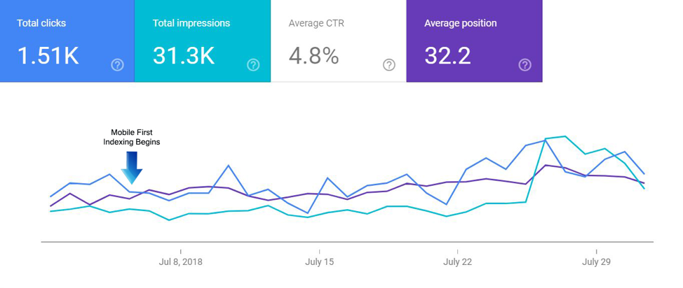

This data indicates a positive correlation between mobile friendliness and site performance. The trend lines for average position, impressions and click through rates have increased after the introduction of mobile first indexing.
Thinking more broadly, if you aren’t optimising your website experience for mobile, then you are missing the mark on your customers’ shift to mobile search.
Your customers want fast loading, easy to navigate, rich mobile content that they can access on the go. You need to be able to rank for mobile search so that customers can find you and have an engaging digital experience with your brand.
How to Prepare for Mobile First Indexing
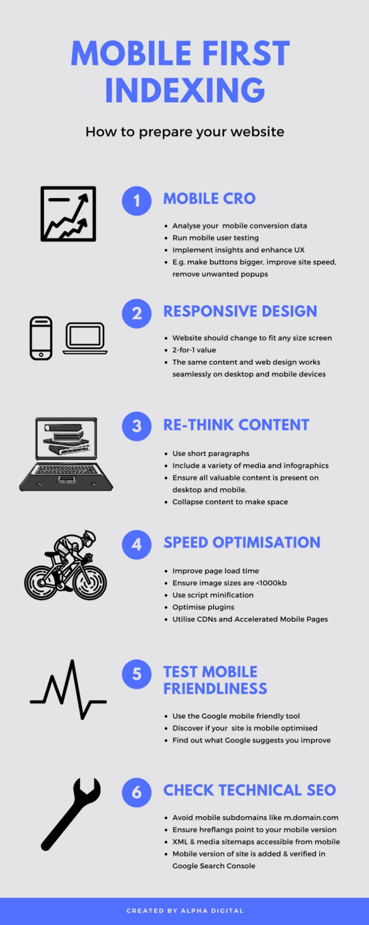

1. Mobile CRO
CRO stands for conversion rate optimisation. It’s about designing a website that improves user experience and structuring it in a way that will get your customers converting. Mobile CRO is an essential step in enhancing the mobile friendliness of your website.
The first step is to analyse your mobile conversion data.
Look through your mobile conversion data in Google Analytics and see if there are any areas with issues or drop off points. For example, the conversion rate on an iPhone 6 could be significantly lower than on other devices. This might trigger you to look further into the user experience on that device, and you could find that the ‘Buy Now’ button has disappeared, and customers simply cannot purchase or convert. All these user experience touchpoints send signals to Google about your mobile friendliness, and worthiness for ranking compared to your competitors.
Secondly, run some mobile user testing.
Gathering direct feedback from your target market is one of the truest measures of mobile friendliness. Use their direct insights to improve your websites ease of use and performance on mobile.
Here are some mobile CRO best practices for you to benchmark against:
- Design for the fat finger: Make buttons and links visible and easy to click
- Site speed: No one wants to wait, especially on mobile
- Remove pop ups that harm user experience: Make sure they can be easily closed and do not cover valuable content on mobile
- Write content for mobile readers: use shorter paragraphs broken up with visually compelling media
2. Implement a Responsive Design
A responsive design is the biggest factor that can help you rank well with mobile-first index in the long term. It’s worth putting in the effort today so that you can rank better in the near future.
A mobile responsive design changes to fit the size of any screen. That means that you get two for one value from your website, because your design works seamlessly on both desktop and mobile. Your content does not need to be re-created on a separate mobile website, and easily crosses over across devices.
3. Rethink Your Content
Screen space is prime real estate on smaller mobile devices. Adding to that, you are now going to need to ensure that the mobile version of your website has the same high quality, valuable content that exists on your desktop.
Therefore, you need to carefully think about how you are going to create a rich content experience that is seamless to navigate on mobile.
Here is how to make your content mobile friendly:
- Rethink your articles: A long form blog post might look fantastic on a desktop however it can be intimidating on a mobile device. Use shorter paragraphs and break up your content with rich visual media
- Use a variety of visuals: Audio and visuals perform very well on mobile. When you have a good combination of audio, video and text you are catering to a wider variety of users and create a much better experience.
- Utilise infographics: Infographics get liked and shared on social media more than any other content. They are a fantastic way to summarise your content in a user-friendly snapshot and will drive valuable traffic back to your website when they are shared.
- Ensure content is crawlable: Content formats on the mobile version need to be indexable. For example, include alt attributes for mobile images.
- Implement structured data: use the same structured data mark-up on both mobile and desktop
- Optimise your meta data: Consider using shorter character counts for the smaller screen, whilst ensuring the same information and relevant keywords are communicated.
- Select image sizes to fit smaller screens: Ensure that you set appropriate image widths so that they fit onto mobile screens.
Most importantly, ensure that no content is lost on the mobile version of the site.
The mobile site will be indexed first, so anything that is exclusive to your desktop website will likely ignored.
Collapse your content on mobile, rather than excluding it to make better use of your prime screen real estate.
4. Speed Optimisation
Google has recently announced that slow-loading content will not perform as well for both desktop and mobile searchers.
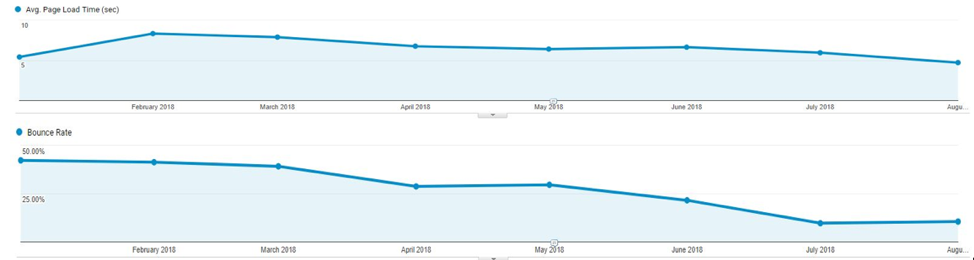

You’ll find that in most instances, if your site is providing a good experience but has a rather disappointing page speed, you’ll have an increased bounce rate. By reducing page speed your bounce rate will improve.
People want to be able to find answers and information as soon as possible, and Google is now using page speed as a ranking signal for both desktop and mobile searchers.
If your page takes longer than 3 seconds to load on mobile, most users are likely to leave. It’s very unfortunate to take so much effort to get them there and then quickly deter them with a slow speed oversite.
Here are some tips for speeding up your page load time:
- Image optimisation: Find the right balance between image quality and size. Ensure that your image sizes are smaller than 1000kb.
- Use script minification: Remove all unnecessary characters from your source code without changing your website’s functionality.
- Optimise plugins: Having too many plugins can weigh down your load time. Remove any that are unused.
- CDNs: Minimise the distance between visitors and your website’s server with cached versions of your content.
- Accelerated Mobile Pages: An open-source Google innovation released in 2016, designed to make mobile website content load almost instantly.
5. Test Your Site with the Google Mobile Friendly Tool
Google released their mobile friendly tool ‘Think with Google’ earlier this year to help users discover whether their site is mobile optimised and what they need to improve. The test itself covers page speed, estimated visitor loss, industry comparison, and recommended fixes.
6. Remove Any Loose Ties on Your Technical SEO
Avoid using mobile subdomains like m.domain.com
While subdomains may seem a bit easier to set up rather than having to create a responsive site, they don’t send very strong signals through to Google. Unfortunately, Google is more likely to view the subdomain as a separate website, and therefore view your main website as non-mobile-friendly. This will more than likely lead to problems when attempting to index the desktop site.
Here are some further, yet equally important technical checkpoints:
- Hreflang: if you using rel=hreflang for internationalisation, ensure that your mobile URL Hreflang annotations also point to the mobile version of your country or language variants.
- XML and media sitemaps: Ensure that links to site maps and robots directive are accessible from the mobile version.
- Search Console Verification: Make sure that the mobile version of your site is added and verified to Google Search Console!
Key Takeaways
Site owners, marketers and SEO’s can no longer live in a desktop-first world. The traditional strategy of creating everything with the desktop in mind and then transferring it over to mobile no longer fits our mobile-led world.
As you start implementing your mobile-first strategy, here are some key points to keep in mind:
- A mobile-friendly experience combined with highly relevant content will increase your website’s search engine visibility and conversion rate across multiple devices.
- Responsive website design is the most efficient way to get mobile friendly
- Fast loading content is essential for your websites mobile and desktop performance
Mobile has officially overtaken desktop use, so it’s time to update your digital strategy to better rank in both Google and your customers eyes.
If you’re looking for more on the topic of mobile optimisation, check out these Marketing.com.au articles: